Color Rendition Of Light Sources: Color Rendering Index (CRI) & Beyond (TM-30, CQS, GAI...)
Abstract: The color rendering characteristics of a light source include color fidelity, color discrimination, and color preference. The importance of a light source’s color rendition is manifested in every aspect of life and work.
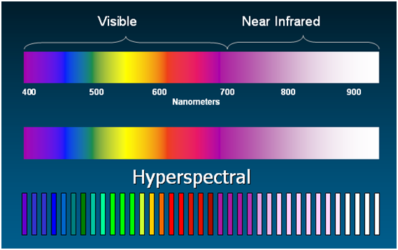
The color quality of a light source relates to its ability to faithfully reproduce the colors of objects, effectively render colors that humans prefer, and efficiently aid in color discrimination. White light produced by an artificial light source is a mixture of various or several monochromatic colors from the visible portion of the electromagnetic spectrum from approximately 400 nm (nanometer) to 700 nm. The relative amount of radiation at each wavelength of the visible radiation spectrum is known as spectral power distribution (SPD). The SPD of a light source determines its color characteristics: the color appearance of a light source itself and its color reproduction performance. In the consumer world, two metrics are used to describe the color characteristics of a light source: correlated color temperature (CCT) and color rendering index (CRI). These metrics allow lighting designers and end-users to control and predict the color impact of different light sources.
CCT and CRI
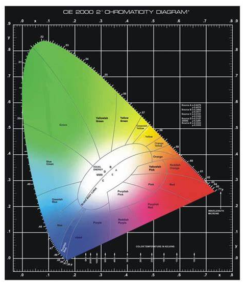
Although correlated color temperature (CCT) is not relevant to the current discussion, this metric often introduces some confusion with CRI among general consumers. CCT, measured in Kelvin (K), defines the color appearance of a light source. The use of CCT allows the color of a light source to be easily visualized. White light falls into three general color tones: warm, neutral and cool. White light with a nominal CCT of 2700 K appears warm. Neutral whites (around 3500 K) have middle tones. White light with a high CCT (4000 K or above) imparts a cool bluish tint. The color temperature of a light source establishes the color scheme of a space. The perception of warm or cool tones in white light affects people’s subjective assessment of a space.
The concept behind color rendering index (CRI) is to provide a relative measurement of how the color rendition of a light source compares to that of a reference radiator. This index tells us to what degree colors of an illuminated object are rendered accurately. Light sources with the same CRI can have different CCTs, and vice versa. While color rendition also influences many subjective perceptual attributes of a space, it is designed to quantify the color reproduction performance of a light source. Therefore, the numerical measurement of color rendition has a qualitative indication. For example, higher the CRI, better the color rendition of a light source. A CRI of 100 indicates that the light source renders colors spectrally equal to a reference source. On the other side, the numerical value (e.g. 2700 K, 3000 K, 3500 K, 4100 K, or 5000 K) assigned to a light source by a color temperature scale offers only a color reference.
On a side note, many people select the CCT of a light source based on their visual preferences. This is not a good practice. In fact, there is a big science behind the selection of light source CCTs. In the course of human evolution, the circadian system has adapted to the cycle of natural sunlight which dynamically changes in intensity and color from sunrise to sunset. Our master biological clock registered these subtle changes and responds to the light around us. In the evening, at least two hours before bedtime people should not be exposed to bright and cool white light. Cool white light, in particular the optical radiation with greater than 5000 K CCTs, contains in its light spectrum a high percentage of blue which suppresses the production of melatonin. Melatonin is a hormone secreted into the blood by the pineal gland. It promotes a better quality of restorative sleep. As such, long term exposure to high CCT optical radiation during the night can lead to circadian disruption which can produce negative health effects. Circadian disruption has been shown to be associated with increased cancer risks. Chronic suppression of melatonin release prevents the human body from developing a vital protective mechanism against the growth of cancer cells.
How Important Is Good Color Rendition?
The importance of a light source’s color rendition is manifested in every aspect of life and work. Before the emergence of fluorescent lamps the color reproduction performance of a light source had never been a concern. Halogen bulbs, incandescent bulbs and candle light all have a spectral power distribution that exhibits qualities considerably close to natural daylight, which has a perfect color rendition. This means the human visual system had been comfortable with perfectly rendered environments in both indoors and outdoors ever since our apelike ancestors began to evolve. The introduction of fluorescent lighting was a disaster in terms of color quality. Since then the highly saturated colors of everything around us under artificial lighting are poorly rendered and the human eye has to tolerate the color distortions. However, there’re many applications where poor color rendition can’t be tolerated or allowed.
Visually demanding tasks or color-critical applications at home, offices or studios, be it reading, writing, drawing, painting, photographing or makeup, require accurate color rendering in order to improve task performance, ensure color matching, and/or prevent eye fatigue.
In industrial facilities such as textile factories, food processing plants, printing facilities, car painting workshops and microelectronics assembly lines, high color fidelity lighting allows workers to see colors accurately for performing precision tasks and quality checks while contributing to a safe, productive work environment.
Spectrally enhanced light is capable of rendering more saturated colors which give an environment a more attractive appearance. In hospitality settings such as hotels, restaurants and bars, the vibrancy of colors helps create spaces that delight. A highly saturated ambiance makes skin tones appear more healthy and natural so that people look their best. Flattering light creates an atmosphere of pleasure and excitement for face-to-face interactions.
Retail lighting must have great colors to highlight the premium quality of merchandise and enhance retail displays for maximum impact. High quality light with excellent color rendering should be used to accentuate vividly colored fruit and vegetables and bring out the appetizing redness of the flesh in grocery outlets, to create a fantastic color experience with natural whites and vibrant colors in fashion stores, and to enhance the natural appearance of car finishes in auto showrooms.
Color rendering is a critical factor to take into account in museum, gallery and exhibition hall lighting. The quality of light has a significant impact on visitor engagement. Accent light with a superior color rendition helps bring out the best in displayed artworks. White light abundant in long wavelengths in the spectrum of visible light can be used to boost the color saturation of the artwork or exhibits.
Color rendering is of significant importance in healthcare work. Quick and accurate identification of subtle differences in color can mean the difference between life and death. High quality light is required in surgical procedures to create as reliable visual information (such as unadulterated detail and contrast between adjoining tissues) as possible of the area being operated on. A saturated red in the light spectrum enables optimum visualization of subtle shades of red color in a wound area that is diffused with red tissue and tinted in blood.
Color Rendering Index (CRI)
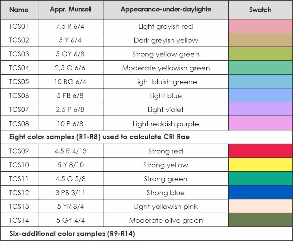
Color rendering index (CRI) is a relative measurement of how well colors are rendered by the optical radiation of a white light source in comparison to a reference radiator with a comparable correlated color temperature (CCT). Administered by the International Commission on Illumination (CIE or Commission internationale de l’eclairage), the CRI is the only internationally accepted standard for measuring color rendering quality. In the calculation of CRI, the color appearance of 14 reflective samples from the standard Munsell range is simulated under both a test source and the reference source. Each particular color is given anRi value as an indication of its color rendering. The range of this value is from 0-100, with 100 representing no color difference between the test source and reference radiator. The principal metric of the CIE system is the general color rendering index Ra, which is calculated by averaging the Ri scores for the first eight of the reflective samples. As such, the highest CRI Ra value is 100 when the radiation spectral distribution of eight test colors closely matches that of reference samples at the same color temperature. In common practices, CRI refers to the Ra value whenever one see only “CRI” is published in a product data sheet.
The need for color rendering varies according to lighting application. A CRI of 80 is often considered the minimum acceptable value for interior ambient and task lighting. Quality artificial lighting generally attempts to replicate the characteristics of natural daylight. If at all possible artificial lighting should bring back the superior color rendering of incandescent lighting which has a CRI Ra of greater than 95. Unfortunately this seems to be impractical because the lighting industry is happy to follow the widely accepted mediocre color rendering standard established by fluorescent lighting which has typical CRI Ra values of approximately 70-80.
Limitations of the CRI Color Rendering Metrics
The color science that the CIE CRI calculation uses is long outdated. CRI Ra is calculated using only eight of the 14 reflective samples which are all of low to medium chromatic saturation. Lamps with a high CRI may render colors of low saturation well, but can perform poorly on more saturated colors. In particular, the R1-R8 test samples have limited curvature in the red portion of the visible spectrum and thus may not provide much spectral reflectance for the red color. Typical 80 CRI LEDs are over-saturated in the blue and green spectrums and have inadequate red performance, which can lead to poor color rendering of objects containing red pigments, such as the hemoglobin in human skin. Thus the test sample 9 (a saturated red color whose index is identified as R9) is often listed individually as a supplement to the CRI general index Ra in color-critical lighting applications.
In addition to the fundamental flaw in chromatic adaptation calculation and color difference, arithmetic averaging of the Ri of eight test colors can mask very poor rendering of one or more color samples. A single Ra value tells nothing specific about the spectral content of the source or its deficiencies. Moreover, CRI only evaluates color fidelity, and other color quality characteristics such as chromatic discrimination and observer preferences are ignored. Chromatic discrimination refers to the ability to distinguish between similar colors or subtle difference in hues. This dimension of color quality can deviate from absolute fidelity. Observer preferences relate to the ability of a light source to render objects with a pleasing color appearance. For the human eye a high color preference index is often associated with a high portion of saturated colors in the light spectrum.
Color rendering metrics continue to be developed to address these deficiencies. Supplements to and alternatives for the flawed CRI include TM-30-18 (IES Method for Evaluating Light Source Color Rendition), color quality scale (CQS), gamut area index (GAI), color gamut index (CGI), full spectrum color index (FSCI), color rendering map (CRM), color discrimination index (CDI), color preference index (CPI), color harmony index (CHI), color rendering capacity (CRC), feeling of contrast index (FCI), flattery index (FI), memory color rendering index (MCRI), etc. The most significant indices under consideration are described below.
IES TM-30-18
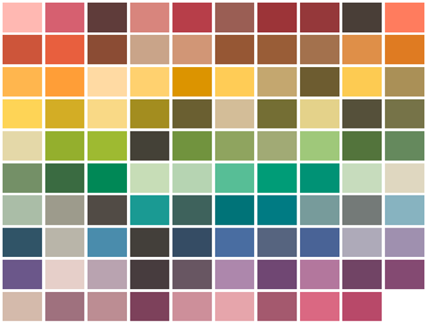
The Technical Memorandum TM-30-18 provides an objective and statistical approach to quantify both overall average properties (color fidelity, gamut area) and hue-specific properties (fidelity, chroma shift, hue shift). TM-30 is an evaluation framework that consists of three primary components: a system for defining the reference illuminant, specification of the color samples, and implementation of a model of human vision. The method utilizes 99 color evaluation samples (CES) to quantify the difference in color rendition between the test source and reference illuminant. It’s important to note that this framework is not designed to directly characterize human perceptions, such as color preference, or to provide a single value that captures the combined color rendition qualities of a light source.
Two indices are provided in this method for capturing color fidelity and gamut area, respectively. The fidelity index (Rf), which is analogous to the single value Ra provided by CRI, indicates the average color fidelity calculated by determining the difference between the CAM02-UCS coordinates of each CES under the test source and reference illuminant, then determining the arithmetic mean of these color differences. The scale for Rf is from 0 to 100, where a value of 100 implies that the source renders all 99 colors in a manner identical to the reference. The gamut index (Rg) describes the increase or decrease in chroma for the given light source. An Rg value of 100 represents an identical saturation level compared to that of the reference. IES TM-30-18 also provides a visual representation of hue and shifts around the hue circle through a visual tool called color vector graphic (CVG).
Color Quality Scale (CQS)
Developed by National Institute of Standards and Technology (NIST), the Color Quality Scale (CQS) is designed to address many of the shortcomings of the CRI. This color rendering quality evaluation system takes into consideration three aspects of color appearance including color fidelity, chromatic discrimination and observer preferences. Instead of using only eight low-chroma color samples that do not span the full range of hues, CQS uses a set of 15 Munsell samples that have higher chroma than those used in the CRI and are spaced evenly along the entire hue circle. CQS also provides an improved chromatic adaptation correction and a more homogeneous color space. The color preference component is addressed by de-emphasizing color differences that moderately increase chroma.
Gamut Area Index (GAI)
The gamut area index (GAI) is a standard gamut index that lays emphasis on tones and vitality of colors. The GAI is complementary to CRI which emphasizes the color fidelity. The eight test-color samples and the color space for calculating CRI Ra are also used in this method. GAI is determined by comparing the area enclosed within a polygon defined by the chromaticities in CIE 1976 u’v’ color space to the color space area produced by the imaginary or theoretical equal-energy spectrum (EES) source wherein radiant power is equal at all wavelengths. The larger the GAI, the more vividness with which the light source renders object colors. The EES is scored as 100, but the GAI can exceed 100 when the ability of the test light source to saturate color outperforms that of an equal-energy source.
Television Lighting Consistency Index (TLCI)
All the above-mentioned color rendering metrics have been developed for the human eye. However, in today’s connected world we increasingly rely on video and film cameras to experience the world. The scene rendered by a light source can have a different visual effect on television because the response curves of the film emulsion or video sensors vary significantly from those of the human eye. Thus, an alternative to the CRI has been needed to evaluate the chromaticity quality of a light source when used within the television environment. The Television Lighting Consistency Index (TLCI), developed by the European Broadcasting Union (EBU), seeks to address many of the issues associated with the use of LED lighting in film and television production. TLCI uses a methodology similar to that of CRI and CQS in that it uses a standard set of color test samples from the X-Rite ColorChecker chart and a reference light source (a mix of light produced by black body radiator and daylight between 3400 K and 5000 K). The spectral power distribution of a test source is measured by a spectroradiometer and the calculations are performed by a software analysis program.
The Color Science of LED Lighting
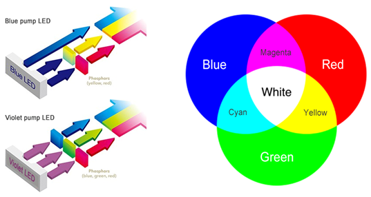
The advent of LED technology renders the old color science of artificial light sources obsolete. Despite having a narrow spectral line width and producing monochromatic light such as red, blue or green, LEDs can be packaged to produce white light in any spectral power distribution and thus yield the desired chromaticity and color rendition. There are essentially two ways to produce white light with LEDs. White light can be created through additive color mixing by combining the three primary color diodes of red (R), green (G) and blue (B). However, this method is impracticable because 1) the spiked spectrum lacks spectral content in cyan, yellow and orange, which leads to an inadequate color rendition; 2) poor luminous efficacy due to the inefficiencies of green and red direct emission; and 3) high cost from both the use of multiple-colored diodes and the need for adequate control of these diodes.
The second and also the universally adopted method is wavelength conversion which utilizes a combination of a monochromatic, large band gap InGan LEDs and light converting phosphor materials. LEDs produced using this method is called phosphor-converted LEDs (PC-LEDs) and are broken into two categories: blue-pump LEDs and violet-pump LEDs. Blue-pump LEDs consist of a blue LED chip which is coated with an organic polymer containing a yellow phosphor. The phosphor down-converts part of the higher energy, short wavelength blue light into lower energy, longer wavelength light which mixes with the remaining blue light to produce the desired white light. Violet-pump LEDs combine a violet LED and three phosphors (blue, green and red). The blue, green, and red phosphor emissions allow the LED package to distribute spectral energy across the entire visible spectrum, which results in an excellent color rendition.
Unethical Practices in the Lighting Industry
The unprecedented ability to control how light renders colors is one of the strengths of LED lighting. Unfortunately, this does not translate to a good color quality in artificial lighting which is now ubiquitously powered by LED technology. The inherent reason is that the lighting industry doesn’t desire to sacrifice the profit margin for a higher color quality of light. This reason also explains why lighting manufacturers never attempt to inform consumers that high CCT lighting could disrupt the circadian rhythm and negatively affect the human health. Also, the regulatory authorities weigh too much on the efficiency side of lighting products and barely make an effort on improving the light quality of LED products.
The Trade-off between Color Rendition and Luminous Efficacy
The industry’s reluctance of introducing high color rendition into LED lighting can be attributed to the trade-off between luminous efficacy and color quality. Blue-pump LEDs, which have the highest efficacy and the lowest manufacturing cost among LEDs fabricated using different methodologies, have grabbed a dominant share in the general lighting market. To enable the LED package to produce all the emissions required to render the widest range and highest saturation of colors, a phosphor mixture of higher cost has to be used. An LED with a good color rendition has an abundance in long wavelengths, which means a large portion of blue light undergoes the Stokes shift being transformed from shorter wavelengths to longer. This Stokes shift inevitably leads to a huge energy loss and thus substantially compromises the package efficiency. The human visual system does not respond equally to all wavelengths. The highest conversion by the eye sensitivity over the spectral distribution of light is at about 555 nm. The distance of the energy peak of high CRI LEDs from the 555 nm wavelength compounds the loss in luminous efficacy.
The solution for improving color rendition without causing efficiency loss in blue-pump LEDs is to use narrower linewidth red wavelength down-converters. In this case, the Stokes loss that occurs during wavelength down-conversion can be significantly reduced. Down-converters developed for this purpose include narrow bandwidth red phosphors and quantum dots.
Guangdong Mason Technologies, a leading LED package company, offer a wide range LED light source products for customers.

